
CanBe
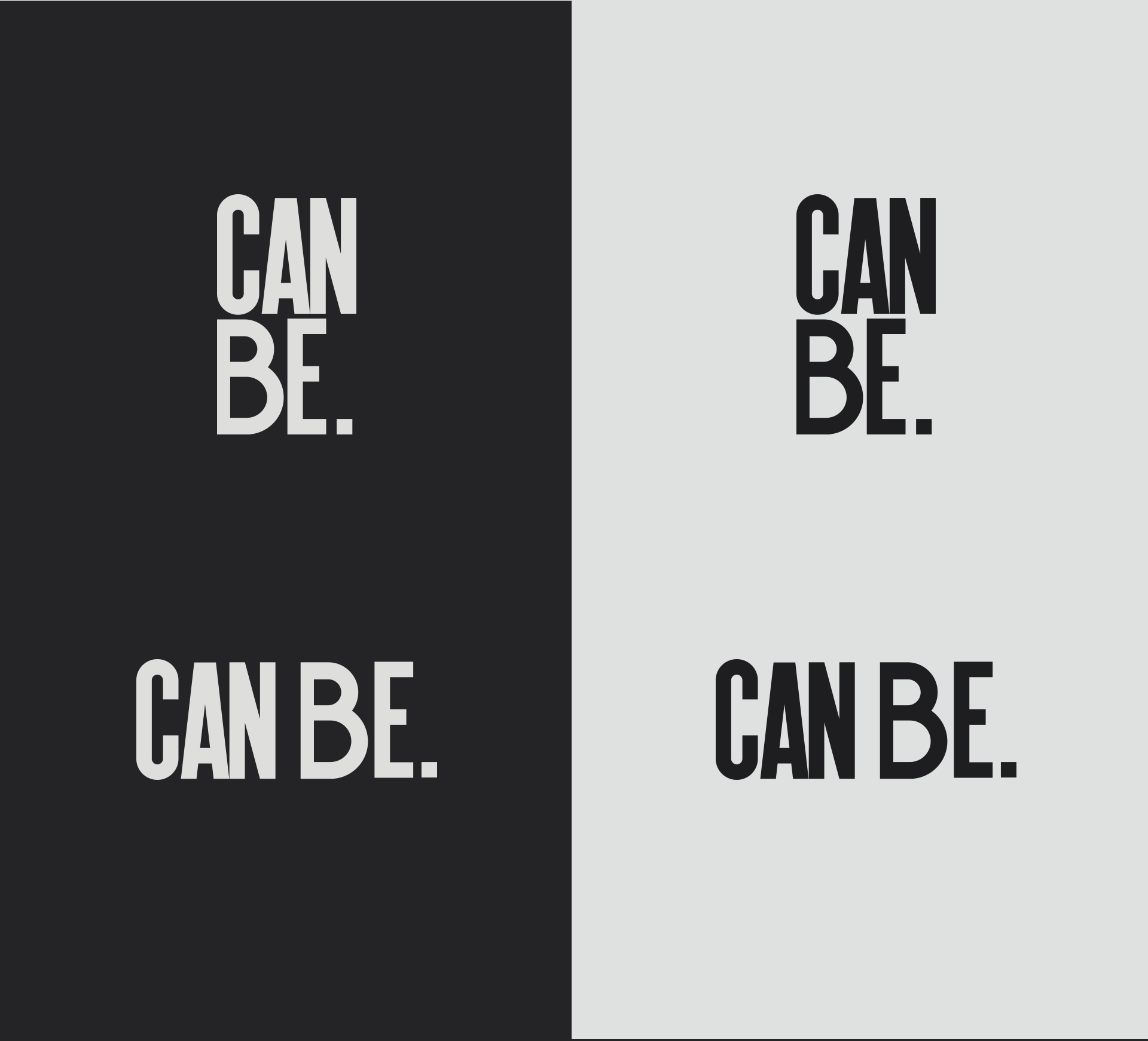
The idea behind this logo was create a brand that would be strong yet versatile, minimalistic but carring a bold statement.
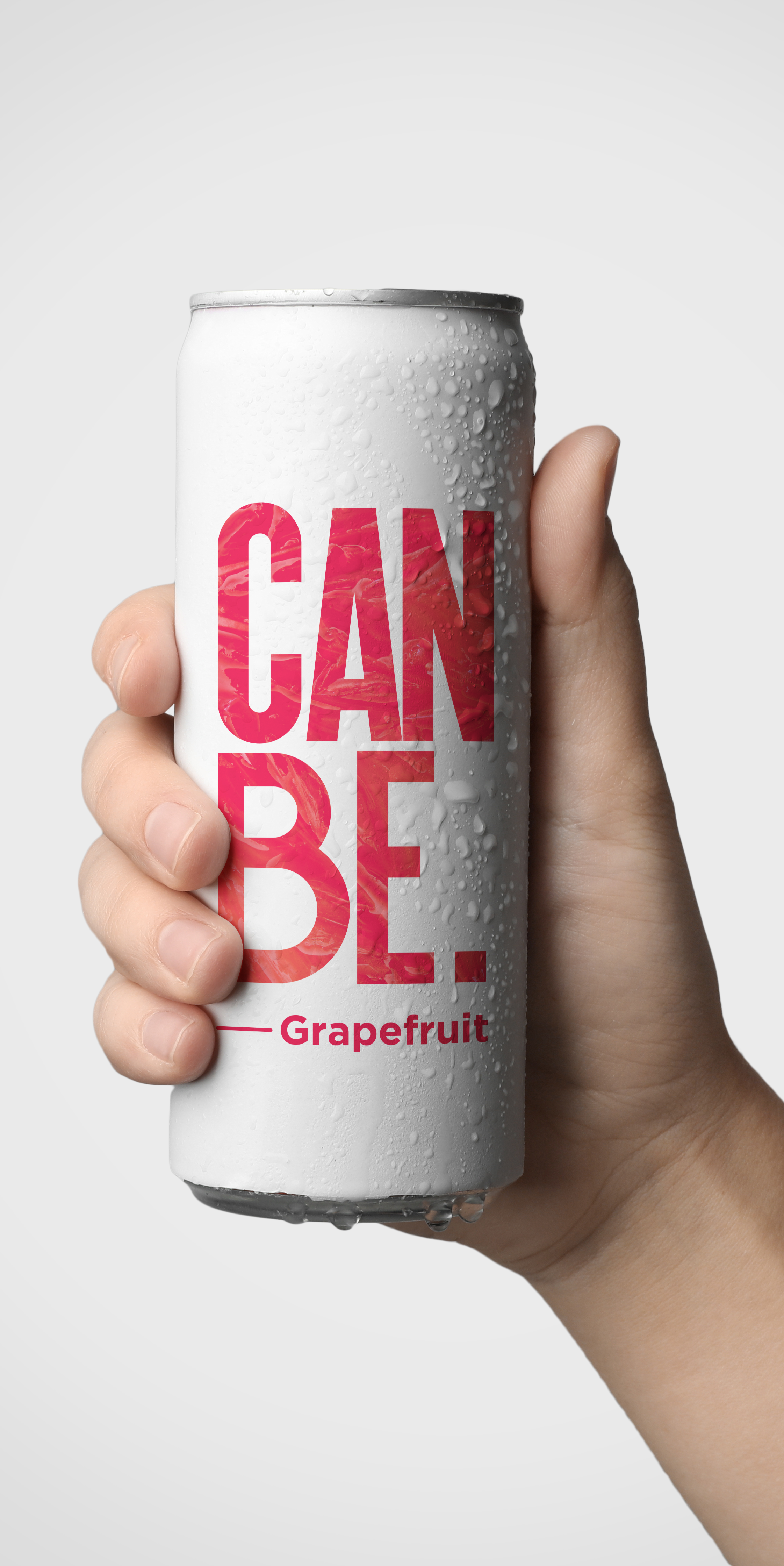
The concept is base on typography as a main element. It could not be shy it needed to use a lot of real state in the can. It also needed to be able to work in conventional horizontal formats.
It needed to leave the door open for the adition of future flavors, that meant possible colors or text.

Packaging


